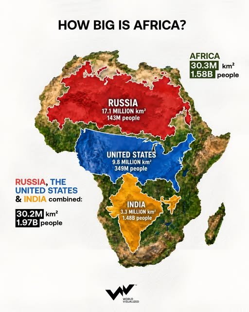
Covering roughly 30.3 million km², Africa is almost exactly the same size as Russia, the United States and India combined. Together, the three countries span about 30.2 million km² — more than 99.5% of Africa’s total area. The remaining difference is only around 146,000 km², roughly the size of Nepal.
Yet an almost identical amount of territory contains very different numbers of people. In 2026, Russia, the U.S. and India together account for roughly 1.97 billion people, compared with an estimated 1.58 billion across Africa. That means the three countries have around 384 million more inhabitants despite occupying virtually the same area.
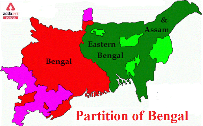
The comparison also exposes a familiar problem in how we visualize the planet. The Mercator projection, still one of the world’s most recognizable map formats, increasingly exaggerates landmass size toward the poles. As a result, northern territories such as Russia and Greenland appear much larger relative to equatorial Africa than they really are. Africa is actually around 14 times larger than Greenland, despite the two appearing comparable on many Mercator maps.
That debate has taken on new significance. On September 4, 2026, the UN General Assembly backed a resolution encouraging wider use of the Equal Earth projection, designed to represent the relative area of continents more accurately.
Africa is not only the world’s second-largest continent. It accounts for roughly one-fifth of Earth’s land surface — a scale conventional maps have often made surprisingly difficult to see.
Author: Saikat Bhattacharya